Narrative was essential in our video because the lyrics weren't something you could portray easily in a music video. We used a different, interesting and attention grabbing story line to make our video stand out from your 'typical' music video, and so it was something to be talked about. Overall i think it achieved this effect and looked really good.
Thursday 15 December 2011
Target audience
Our target audience would be ages 16 - 21, as the genre isn't too restricted i think it would appeal to alot of people within that age group. The artist is seen as different and eccentric, this would appeal to alot of people within this target audience as they are always looks for the newest thing. The uniqueness of the artist is beneficial in gaining fans and makes them seen as a role model.
shot list


When planning our video we made up this shot list, a list of what was happening and what was need in each shot. We mainly stuck to this and came in really helpful because we could move on with filming quickly and didn't have to come up with any ideas on the spot and waste time.
Commentary
When editing our evaluation commentary, we added bits of our video into it, aswell as music clips and screen shots. This was all done in Final Cut, and was really simple to achieve as we had so much practice with actually making the video. We tried to link everything together with the video, e.g the colours of subtitles.
Timeline

At the beginning of our projected we created this timeline. It helped us stay organised, and on top of things. We ticked off what we had completed so we could go back to what was not finished at a later date. We crammed most of our research into the beginning so we had more time for filming and editing. This worked out well because we needed that all important editing time.
Costume
As we wanted our artist to be recognised for their masks, we thought a simple suit with shirt and tie would be best for the character to wear. This looked really good, it made the video more random and bizarre as it looked like your 'everyday business man' but with a pig face or gas mask.
Lighting
As we wanted our video to be in the dark room, we had to think about how we would light the artist so they could be seen. To add to the theme, we decided on a normal torch light as a spotlight, to highlight them and it makes them look creepy as you can't tell what is around them. Also to add the element of 'evil' we used a red light, this worked really well and made the video different. Red ended up becoming a main colour for our artist as it was carried on through to use within our DigiPack and Magazine advert.
Technology
Final Cut was really helpful in creating a professional looking music video. At first, it was hard to get to grips with and didn't really help us to create the look that we wanted our video to have. But after playing around with different tools and effects, we got what we wanted and the end result was pleasing. The main thing that Final Cut enabled us to do, that looked really good, was shot layering. Layering shots up having the same character on the screen at the same time, helped with the 'mental instability' element we wanted for the video.
Editing
Whilst coming towards the end of our editing process, i came in on open evening and added some final touches. After feedback, I added more use of shot layering, as its the most effective shot in the video. Once you get the hang of it using Final Cut, it was really simple to achieve but looks professional and creates the atmosphere we wanted for our video. Also colour correction helped make our shots with weaker lighting into stronger shots and more intriguing. Darkening some shots made them really creepy, for example, the scene where the pig pushes over the main character has been darkened so you cannot see where the character is falling into, this really effective because it makes the viewer think. All effects helped link with the theme of the video.
Wednesday 14 December 2011
Analysis of Artist online advertising
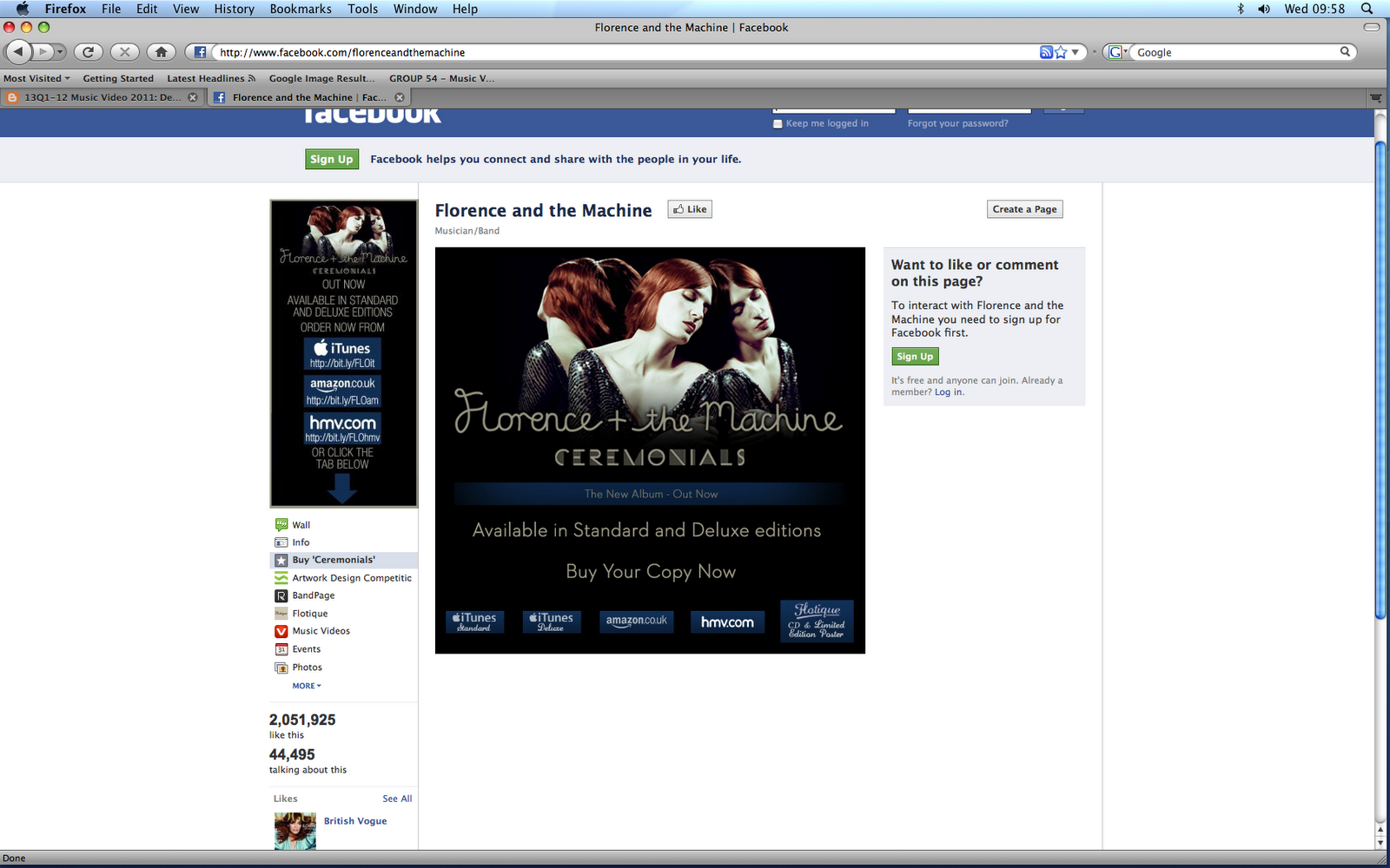

These images show the type of things that the original artist is interested in and the type of people and companies who are interested in the artist. This is effective as it makes people want to like the artist if they can connect with the artist through liking similar things. This is a popular way of advertising as it shows the artist is trendy and enjoys being socially active. If we were to advertise our digipack, in a way other than in a magazine, then we would chose this as it is effective and makes the artist appear popular and they can share what they are interested in and when events are happening such as concerts. Over 2 million people follow Florence and the Machine on just this page so it is a popular way of advertising and a lot of people can connect with the artist with the boom of social media.


Auteur Study
David Fincher


David Fincher was born in 1962 in Denver, Colorado, and was raised in Marin County, California. When he was 18 years old he went to work for John Korty at Korty Films in Mill Valley. He subsequently worked at ILM (Industrial Light and Magic) from 1981-1983. Fincher left ILM to direct TV commercials and music videos after signing with N. Lee Lacy in Hollywood. He went on to found Propaganda in 1987 with fellow directors Dominic Sena, Greg Gold and Nigel Dick. Fincher has directed TV commercials for clients that include Nike, Coca-Cola, Budweiser, Heineken, Pepsi, Levi's, Converse, AT&T and Chanel. He has directed music videos for Madonna, Sting, The Rolling Stones, Michael Jackson, Aerosmith, George Michael, Iggy Pop, The Wallflowers, Billy Idol, Steve Winwood, The Motels and, most recently, A Perfect Circle. As a film director, he has achieved huge success with Se7en (1995), Fight Club (1999) and, Panic Room (2002).
We took inspiration from Fincher as he has worked with many alternative groups and has created many weird films. For that reason we chose to study his work and try to use him as our main auteur inspiration. His movies often features several single frames that flash on the screen in the middle of a scene and frequently has characters in the shadows where you cannot make out their face, which is exactly what we were aiming to achieve in our video.
Mise en scene research
We researched many artists and had a look at individual style costumes and styles. Combining our inspirations of Michael Jackson and Slipknot, we brainstormed what we wanted the artists style to be like. This is what we created:

The artists image will be a mysterious eccentric look which will create a sense of rejection from the mainstream industry which most artists fall under. The artists style would be an outfit which would be weird for example a casual suit with a mask if the artist is male or a casual female outfit with a mask if the artist is female. This would make the artist look stuck between styles and create a sense of mystery which is an ongoing theme with the artist. We want to communicate that the artist is alternative and that they are a new artist to the industry as we think the song would be a good debut single. This would mean that the style and the image of the artist is confused as many fans can then compare to the artist.

The artists image will be a mysterious eccentric look which will create a sense of rejection from the mainstream industry which most artists fall under. The artists style would be an outfit which would be weird for example a casual suit with a mask if the artist is male or a casual female outfit with a mask if the artist is female. This would make the artist look stuck between styles and create a sense of mystery which is an ongoing theme with the artist. We want to communicate that the artist is alternative and that they are a new artist to the industry as we think the song would be a good debut single. This would mean that the style and the image of the artist is confused as many fans can then compare to the artist.
Inspiration
The inspiration of our music video mainly came from two artists and their videos. The first of these was slipknots psychosocial where masks are very potent and there are many extreme, over editing shots which create a psychadelic atmosphere. This is what we aimed to do as the psychological route is the route we used for our music video and the masks were the key props in the narrative. We edited every shot to make it hallucinagenic as this would make the audience feel uneasy and would add to the quirkyness of the artist profile. Another one of our inspirations came from Michael Jackson's Thriller video where the idea of a strong choreagraphed narrative was key in order to portray the artist in a creepy way. We thought this was effective as it stood out as making the single artist individual and Michael Jackson is known for his success. Using all our inspirations, we believe that we managed to incorporate ideas from both and still managed to make ours original and individual. This added to the profile of our almost horror film style character and this meant that we could build around this strongly.
Use of technology
We used a lot of media technology to construct research and plan our products. Blogger was a very good blog to use for research and to look back or to see how to improve the video. Final cut was used to construct the video which was very helpful as we could organise our clips and add colour effects and transitions to it. Photoshop was used to create the ancillary products and edit them in such a way to make them look professional.

This did hinder our time slightly as Photoshop is a time consuming product but we managed to use it eventually. The HD cameras were useful as we could create good professional shots. The still cameras were helpful as we could manipulate our surroundings to take creepy yet interesting shots which we used in our research and for our ancillary products. Overall the technology helped us create a successful product as it was professional, reliable and with enough time, we could fully learn how to use all the technology efficiently. Final cut and Photoshop did hinder us as they were hard to layer but once this was mastered, they did not trouble us.

This did hinder our time slightly as Photoshop is a time consuming product but we managed to use it eventually. The HD cameras were useful as we could create good professional shots. The still cameras were helpful as we could manipulate our surroundings to take creepy yet interesting shots which we used in our research and for our ancillary products. Overall the technology helped us create a successful product as it was professional, reliable and with enough time, we could fully learn how to use all the technology efficiently. Final cut and Photoshop did hinder us as they were hard to layer but once this was mastered, they did not trouble us.

Story Board


After the final product, we realised that our story board was very similar to our final so we stuck to it well. I think that it was effective to stick to the plan as it meant that we had the narrative planned out and we could construct our product with little hesitation.


Timeline

The timeline was a useful excercise to incorporate as we could manage our time effectively and we stuck to it well so we could meet all our deadlines. We could see how much time we had so we could plan well ahead and as a result our products could have more time spent on.
Monday 12 December 2011
Music video evaluation
1.I believe our media products ( video, magazine and digi pack) follow and challenge typical forms and conventions of the professional examples. We followed many of Goodwins points, including: need to sell the artist. We did this by having plenty of shots in our video of our artist. This carried on into our magazine advert and album cover by having the main focal point in them as our artist.
The genre of our products was alternative pop, which we thought about in all of our pieces. We looked at examples from real artists such as Florence and the Machine and Coldplay and we followed and challenged many aspects of the bands music videos album covers, and other forms of media.
n parts of our video we used illustrative scenes that went with the lyrics this was to try and paint a picture in our viewers minds. We developed this idea further by using parts of our video to question the genre for the audience. We mainly did this by pushing the mysterious aspects to new limits, this happened in our filming and more so in our editing, where we used effects and filters visually to create a very unusual feel.
2. I believe that our anciallary producst and our music video worked together well as they support the same concept and genre. The do this by the repetition of similar themes and imagery, imparticular the use of masks begins in our music video and continues throughout. They all also follow the theme of mystery where we used certain costumes and images along with the lyrics of the song and style of the filming to create and eery and dark feel to it.
Our concept was mainly to do with a psychological twist in particular the feel of dual personality which was mainly created by the use of masks and shot layering during the editing process. We tried to give the idea of schizophrenia in the way our artist often appeared more than once in the same shot. The features that we used in final cut and photo shop including effects and filters also helped us to keep our concept alive through all of our products.
3. From the feedback we recieved from people who watched our music video we were able to see where we did well and also where ther was room for improvement from this and the feedback on our rough cut we saw that our story line and concept were hard to follow so using editing we were able to make it more clear on the story and messages we were trying to create we also learnt alot from the feedback we recieved from teachers including that of someone who is experienced in music video production. we were suggested to push our theme and mysterious concept even further. With the use of final cut we added more mystery and surreal images which we believe achieved this.
4. We used a range of media technologies in the making of our products. these included ' final cut' 'photoshop' and ' blogger' Final cut was the main program we used in the making of our music video. this was very useful in the editing part mainly as we had access to many visual effects and filters which really fueled our creativity. The program was also very useful in expanding our concepts and ideas towards our theme, especially in the colour correction and multiplying we used on the artist. we also used Photoshop as the main place to create our ancillary products. Although in some places it proved to hinder our proggress it eventually came to be very useful. We were able to completely change some of the photos we had taken for the magazine advert and our album cover. We could also add to our cover with the use of text and external pictures. We obtained these pictures from websites such as 'Google' and 'Bing'.
Blogger was never used in the actual creation process but it helped very much in the after post-production section, this involved receiving feedback mainly and then adapting our work to make it better quality. We also had HD cameras to use which also helped the quality of our video in particular, along with the still image camera which we used for our ancillary products.
Use of Narrative in the video
Narraitve was a key feature in our video as the lyrics were not as clear as some of the other tracks available. We decided that the narrative for the video will be about the artist stuck in a room, almost like a mime, with people looking in on him/her to create a sense of rejection from society which gives a message to youth that life is hard. Also the colours would be dark with a single light on the artist creating a scene which is sinister. We then incorporated mental instability through the use of masks and multiple characters, such as the pig and the gas mask man, which we find out are all the same person but the artist is imagining them as alternative people. This goes on the him being chased by himself and he choses to stay in the 'mad house' of his mind, rather than escape. We thought this was effective as it was extreme and almost risky to produce a story line based on a mental condition.
Lyric Analysis
There is love in your body but you can't hold it in
It pours from your eyes and spills from your skin
Tenderest touch leaves the darkest of marks
And the kindest of kisses break the hardest of hearts
The hardest of hearts
The hardest of hearts
The hardest of hearts
There is love in your body but you can't get it out
It gets stuck in your head, won't come out of your mouth
Sticks to your tongue and shows on your face
That the sweetest of words have the bitterest taste
Darling heart, I loved you from the start
But you'll never know what a fool I've been
Darling heart, I loved you from the start
But that's no excuse for the state I'm in
The hardest of hearts
The hardest of hearts
The hardest of hearts
There is love in our bodies and it holds us together
But pulls us apart when we're holding each other
We all want something to hold in the night
We don't care if it hurts or we're holding too tight
There is love in your body but you can't get it out
It gets stuck in your head, won't come out of your mouth
Sticks to your tongue and it shows on your face
That the sweetest of words have the bitterest taste
Darling heart, I loved you from the start
But you'll never know what a fool I've been
Darling heart, I loved you from the start
But that's no excuse for the state I'm in
The hardest of hearts
The hardest of hearts
The hardest of hearts
My heart swells like a water at work
Can't stop myself before it's too late
Hold on to your heart
'Cause I'm coming to take it
Hold on to your heart
'Cause I'm coming to break it
Hold on hold on hold on hold on hold on
Hold on hold on hold on hold on hold on
The hardest of hearts (hold on, hold on)
The hardest of hearts (hold on, hold on)
The hardest of hearts (hold on) The main part of lyrics we will focus on are the verses as our imagery contrasts with these lyrics. As we are using masks, the lyrics are about body parts/facial features so our imagery contrasts and confuses the viewer to create an underlying sinister meaning of mental instability. We also show that the line hardest of hearts contrasts with the artist, as the artist changes its mental state every few shots, which would mean that the heart of the artist would be anything but hard. However it can be seen that the artist would have the hardest of hearts, as no emotion is shown by the artist, and this is hard for some viewers to comprehend as emotion is what most people use to understand a person. The 'hold on' section was very potent in our video as it was the bit where the artist is trying to escape his mental position and the lyrics are in a way telling him to hold on qhile he is trying to escape. This adds to the mental instability of the character and strengthens the characters persona that we created. Overall I think we thought a lot about the lyrics as our performance was very contrasting to the lyrics and we interpreted the lyrics in a sinister depressive manner.
Target Audience
Our target audience will be generally older youth, ie 16 to 21 year olds as this is the age group which are most likely to go out and buy the magazines, videos and digipacks. We would also target hardcore fans of all ages to show that the artist appreciates dedicated fans. As the artist is eccentric, this is important as a role model to the fanbase as if the artist did not stick to its themes, then the artist image would not be as strong. We believe this to be a suitable target audience as it is what the main music industry is targeting as their disposable income is most likely to be spent on the music products.
Genre Research
The genre of the artist would be alternative which is based around the songs genre. We researched the genre which is a term of Rock Music used to describe a diverse musical movement that emerged from the independent music underground of the 1980s and became widely popular by the 1990s. Although the term was most commonly associated in its commercial heyday with a loud, distorted guitar sound, its original meaning was broader, referring to a generation of musicians unified by their collective debt to either the musical style, or simply the independent, D.I.Y. ethos, of punk rock, which in the late 1970s laid the groundwork for alternative music. At times, "alternative" has been used as a catch-all description for music from underground rock artists that receives mainstream recognition, or for any music, whether rock or not, that is seen to be descended from punk rock.
By the end of the 1980s, magazines and zines, college radio airplay and word of mouth had increased the prominence and highlighted the diversity of alternative rock, helping to define a number of distinct scenes such as industrial music, gothic rock, jangle pop, noise pop, C86, Madchester and shoegazing. Most of these subgenres had achieved minor mainstream notice and a few bands representing them, such as Husker Du and R.E.M., had even signed to major labels. But most alternative bands' commercial success was limited in comparison to other genres of rock and pop music at the time, and most acts remained signed to independent labels and received relatively little attention from mainstream radio, television or newspapers.
Some examples of alternative rock bands that have achieved commercial success and mainstream critical recognition are Red Hot Chili Peppers, R.E.M., The Smiths, The Black Keys, Alice in Chains, Pearl Jam, Liz Phair, The Strokes, Yeah Yeah Yeahs, Nirvana, Foo Fighters, The Smashing Pumpkins, The Flaming Lips, Modest Mouse, Green Day, Oasis, Weezer, Radiohead, The White Stripes, Linkin Park and Muse. All these artists have made main media products and they show off the artist through the products in s similar way. This meant that our digipack and the magazine advert are fairly similar to the style which is in the music video so that the audience can identify with the artist through these different types of media.
Track Listing research
We thought that it would be a good idea to use tracks already made by 'Florence and the machine' as it would look professional and we would not have to create any silly track names for our digipack. To find her track listings, we went on wikipedia and looked at the track listing for her album Lungs Deluxe Edition.

These tracks were:
- Hardest of Hearts
- Rabbit Heart
- You've got the Love
- Hurricane Drunk
- Blinding
- Drumming Song
- Kiss With A Fist
- Howl
- Cosmic Love
- Bird Song

These tracks were:
- Hardest of Hearts
- Rabbit Heart
- You've got the Love
- Hurricane Drunk
- Blinding
- Drumming Song
- Kiss With A Fist
- Howl
- Cosmic Love
- Bird Song
Research into Posing for magazine ad and digipack
There was not really any research for our posing as we were lucky in that while we were walking past a circular light, an idea came to us that if the artist stood in front of this light, then there would just be a silohette of the artist, which was always the intention from our pitch. We gained inspiration to do this from Michael Jacksons 'This Is It' album cover as it is bold and only the outline of the artist can be seen, showing his illusive persona. We believe that this worked really well as it created a bold image and was easy to adapt in photoshop to create a unique logo and image/statement for our artist.
Font Research
Researching fonts for us was very important because our digipack and magazine ad focused on a sole image of the artist, it was important for us to have text to strengthen the image. Straight away after looking at other works from students and professional artists, it became apparent that our artist would need a bold bright type text. We chose electric blue in the end as it stood out and contrasted with the blood red image and created a creepy atmosphere. Finding an electric blue font was quite tricky but after a lot of scrolling through photoshop fonts, we discovered the one we wanted.
Evaluation Commentary Final
Evaluation Questions
1. Our media product used many conventions of real media products. One of these was intertextuality where the video featured images of other artists in a subtle way, for example the hat and mask were mimicking Michael Jackson. The magazine advert referenced slipknots advert with the mask blurred onto a silhouette to create a sense of anonymity. The digipack used this same reference but in a more sinister colour. Another convention was voyeurism where in the video the artist was barely visible in the darkness creating a sense of mystery. In the ancillary products it was used through the lighting to blur the face of the artist. Another convention was the genre, quirky alternative, which was used throughout the products through extreme colours. In just the video, the music/visuals and lyric and visuals were contrasting to create a sense of disturbance as it was uncomfortable for the viewer. This helped to sell the artist as they appeared creepy and mysterious and so people would want more.
2. The combination of the products was effective as the video itself introduced the artist, which was always the intended idea since the pitch, for it to be a debut single. Meanwhile the two other products sold the artist in a more general way as the masks were not so potent; however the colour scheme remained the same. The concept we were trying to communicate was that the artist was mysterious and almost anonymous, and so we tried to make the audience of the products want to know more about the artist. We achieved this through the use of lighting to make the artist look quirky but at the same time through the masks to make the artist anonymous and creepy. This meant that the image of the artist was easy to create as it was almost like a character in a horror film. They were successful at attracting the target audience as the creepy horror film type label of the artist made our target audience interested in what the artist was about. Also the confusing element made the narrative sophisticated and this would appeal to hardcore fans.
3. We have learnt a lot from audience feedback since the pitch, it was has been very mixed and so we could strengthen our products. The feedback from the pitch was mainly positive as we had a lot of detail and we built up a strong character bio and our goodwins points were well planned so we had a good base to create the music video. What we learnt from this is that it is important to plan well before the products are created. Negative feedback was that it looked very hard to achieve what we had planned and what we learnt from this is that we should set aims which are not too complicated to achieve; the quality of our video fell as a result of this. Feedback on our rough cut was generally positive as the visuals were creepy and matched the music. There were good uses of lighting and editing and our extreme shots were good. The masks added to the mystery of the song and overall it was a unique and creative. What we leant from this was that it was important to be creative and extreme as this made the products more unique. Negative feedback was that there could have been a wider range of shots and the narrative was a bit confusing. What we learnt from this was that we should have spent more time planning in more shots and made the story more clearer. The final cut feedback was all good except that the visuals did not seem to match the lyrics. What we learnt from this was that a simpler video would have made it easier to follow.
4. We used a lot of new media technology to construct research and plan our products. Blogger was a very good blog to use for research and to look back or to see how to improve the video. Final cut was used to construct the video which was very helpful as we could organise our clips and add colour effects and transitions to it. Photoshop was used to create the ancillary products and edit them in such a way to make them look professional. This did hinder our time slightly as Photoshop is a time consuming product but we managed to use it eventually. The HD cameras were useful as we could create good professional shots. The still cameras were helpful as we could manipulate our surroundings to take creepy yet interesting shots which we used in our research and for our ancillary products. Overall the technology helped us create a successful product as it was professional, reliable and with enough time, we could fully learn how to use all the technology efficiently. Final cut and Photoshop did hinder us as they were hard to layer but once this was mastered, they did not trouble us.
Wednesday 7 December 2011
How we changed rough cut to final cut
After recieving feedback on our rough cut we decided to make some changes to give our music video more in depth content. We mainly did this through editing in final cut where we used shot layering and colour correcting in particular to add to the messages and the themes we were trying to create and communicate.
We colour corrected most images to a fire red colour to make the video more intense, while in mellow parts of the video we had a black and white colour corrector scheme to make this contrast with the intense parts of the video, this also added to the mental instability feel we were aiming for. With the two prodominant colourdifferences we felt that it added to the idea of schitzophrenia and created a split personality illlustrating the lyrics.
We also analysed other videos by students and professional artists to see how we could improve our video. In particular we found the 'Slipknot' video useful as it was extreme and we realised we did not have to hold back on effects. In the end the analysis of theses examples made us change the overall idea of the video, not in our messages but in the intensity and quality we achieved.
Sunday 4 December 2011
Commentary Analysis
I watched the Harry Potter and the Deathly Hallows Part 1 commentary and analysed its main features.


The three main characters, Daniel Radcliffe, Rupert Grint and Emma Watson described how certain scenes were created with the occasional word from the director and producer. The way in which this was achieved was you saw the actors talking into the camera while in the corner of the screen was the footage they were talking about. The main points they talked about were the target audience, how well the film was received in cinema and the special effects that were used in the making of the film.
Pitch Feedback
The pitch which was produced on prezi for our gorup was a large success in terms of feedback as it had a lot of detail and was well presented. Unfortunately I was the only one of the group in the class so I had to present on my own. Most feedback was about how the artist had been well thought up and how it had a strong characteristic. The narrative was also strong as it had a clear story and some ideas on how to create it. The only negative feedback was that the idea seemed quite eccentric and our peers were curious on how we would achieve our goals. Apart from that it was a strong pitch and what we learnt from this is that it is important to plan well as we had a good base to start the project.
Thursday 1 December 2011
Digi pack


Right - This is our original draft of our digi pack cover. We chose the imagery mainly from just our music video of the single we chose, we later received feedback that sugested it would be better to make it less particular to the single and more general to the artist. However we kept the 'hand' as we thought it incapsulated the overall theme and it was different but still relatable.
Left - Here is our finished DVD cover, here we created a totally new image. This involves a silhoette and a brain, which yet again is different but still relatable and something unique to the artist. Also bringing in the colour blue adds a new look as oppose to the red and black theme which is strong throughout our work.
Magazine Advert


Left - This was our original magazine advert. At first we were very pleased with it, however after feedback from others, we realised that instead of advertising the album, it was more specific to the single. This is because we just used images that related to our music video and just stated the name of the song.
Right - This was our second design, which we chose as our final as it displayed a similarities to our single and our album as it created a new image and still kept a likeness to the idea we tried to portray in the music video itself.
Commentary Script
When planning our video for the song 'Hardest of Hearts' by Florence and the Machine we wanted to give it a mysterious and different feel to a 'typical' alternative pop music video. Leading up to shooting our video we researched into the genre and tried to fit into its conventions.
In the video, the music/visuals and lyric and visuals were contrasting to create a sense of disturbance as it was uncomfortable for the viewer. This helped to sell the artist as they appeared creepy and mysterious and so people would want more.
One of these was intertextuality where the video featured images of other artists in a subtle way, for example the hat and mask were mimicking Michael Jackson. This also fitted in with our genre and achieved the effect we wanted.
The concept we were trying to communicate was that the artist was mysterious and almost anonymous, and so we tried to make the audience of the products want to know more about the artist. We achieved this through the use of lighting to make the artist look quirky but at the same time through the masks to make the artist anonymous and creepy.
This meant that the image of the artist was easy to create as it was almost like a character in a horror film. They were successful at attracting the target audience as the creepy horror film type label of the artist made our target audience interested in what the artist was about. Also the confusing element made the narrative sophisticated and this would appeal to hardcore fans.
Within the video we 'meet' two new people which later on become masked, however this is the same person throughout, this suggested an element of mental instability, linking back to the sinister edge we were looking for.
Whilst filming we tried to keep a clear narrative, however we are aware that at some points it may become confusing to some viewers, but we don't see this as a negative as it makes the viewer think more about the video and the story behind it.
After filming and editing our video into a final product we created some ancillary products. This involved a DigiPack and Magazine advert. When making these products we considered our theme but ended up making the products more particular to the single rather than the album.
This helped us to develop our artist by making different images that are unique to them. They still linked well and just made the products look more exciting. At first we did use images that were from the video but after feedback we decided to go for a new look and ended up creating a better final product.
We have learnt a lot from audience feedback since the pitch, it was has been very mixed and so we could strengthen our products. The feedback from the pitch was mainly positive as we had a lot of detail and we built up a strong character bio and our goodwins points were well planned so we had a good base to create the music video. What we learnt from this is that it is important to plan well before the products are created.
Negative feedback was that it looked very hard to achieve what we had planned and what we learnt from this is that we should set aims which are not too complicated to achieve; the quality of our video fell as a result of this.
More negative feedback was that there could have been a wider range of shots and the narrative was a bit confusing. What we learnt from this was that we should have spent more time planning in more shots and made the story more clearer.
Feedback on our rough cut was generally positive as the visuals were creepy and matched the music. There wee good uses of lighting and editing and our extreme shots were good. The masks added to the mystery of the song and overall it was a unique and creative. What we leant from this was that it was important to be creative and extreme as this made the products more unique.
The final cut feedback was all good except that the visuals did not seem to match the lyrics. What we learnt from this was that a more simple video would have made it easier to follow.
We used a lot of new media technology to construct, research and plan our products. Blogger was a very good blog to use for research and to look back or to see how to improve the video. Final cut was used to construct the video which was very helpful as we could organise our clips and add colour effects and transitions to it.
At first Final Cut was hard to get to grips with and difficult to create the vision we had for our video. After experimenting with different techniques and visuals, Final Cut became very helpful and gave a professional look to our video.
One part of Final Cut that was very useful for our editing process was the effects that we could use such as colour correction, shot layering and cross dissolves which we used as cuts in certain scenes, and many more.
Shot layering was an idea we cam up with in the research section of our project, as it linked back to the overall theme of mental instability. It looks really effective and we continued to use it numerous times in the video.
The HD cameras were useful as we could create good professional shots. The still cameras were helpful as we could manipulate our surroundings to take creepy yet interesting shots which we used in our research.
We also used many websites which helped us with our research on music videos and on audiences we would target. The websites we used were: Youtube, Myspace, NME (and other magazine websites). We also gained inspiration from watching films such as Saw which uses masks as a focal point for the audience.
Overall the technology helped us create a successful product as it was professional, reliable and with enough time, we could fully learn how to use all the technology efficiently. Final cut did hinder us as they were hard to layer but once this was mastered, they did not trouble us.
As a group we are very pleased with the end result, as it achieved what we had originally planned and we think it sends out the message that we wanted. Also from evaluating and comparing professional examples, we believe our music video looks sophisticated and professional.
Subscribe to:
Posts (Atom)