1. Our media product used many conventions of real media products. One of these was intertextuality where the video featured images of other artists in a subtle way, for example the hat and mask were mimicking Michael Jackson. The magazine advert referenced slipknots advert with the mask blurred onto a silhouette to create a sense of anonymity. The digipack used this same reference but in a more sinister colour. Another convention was voyeurism where in the video the artist was barely visible in the darkness creating a sense of mystery. In the ancillary products it was used through the lighting to blur the face of the artist. Another convention was the genre, quirky alternative, which was used throughout the products through extreme colours. In just the video, the music/visuals and lyric and visuals were contrasting to create a sense of disturbance as it was uncomfortable for the viewer. This helped to sell the artist as they appeared creepy and mysterious and so people would want more.
2. The combination of the products were effective as the video itself introduced the artist, which was always the intended idea since the pitch, for it to be a debut single. Meanwhile the two other products sold the artist in a more general way as the masks were not so potent, however the colour scheme remained the same. The concept we were trying to communicate was that the artist was mysterious and almost anonymous, and so we tried to make the audience of the products want to know more about the artist. We achieved this through the use of lighting to make the artist look quirky but at the same time through the masks to make the artist anonymous and creepy. This meant that the image of the artist was easy to create as it was almost like a character in a horror film. They were successful at attracting the target audience as the creepy horror film type label of the artist made our target audience interested in what the artist was about. Also the confusing element made the narrative sophisticated and this would appeal to hardcore fans.
3. We have learnt a lot from audience feedback since the pitch, it was has been very mixed and so we could strengthen our products. The feedback from the pitch was mainly positive as we had a lot of detail and we built up a strong character bio and our goodwins points were well planned so we had a good base to create the music video. What we learnt from this is that it is important to plan well before the products are created. Negative feedback was that it looked very hard to achieve what we had planned and what we learnt from this is that we should set aims which are not too complicated to achieve; the quality of our video fell as a result of this. Feedback on our rough cut was generally positive as the visuals were creepy and matched the music. There wee good uses of lighting and editing and our extreme shots were good. The masks added to the mystery of the song and overall it was a unique and creative. What we leant from this was that it was important to be creative and extreme as this made the products more unique. Negative feedback was that there could have been a wider range of shots and the narrative was a bit confusing. What we learnt from this was that we should have spent more time planning in more shots and made the story more clearer. The final cut feedback was all good except that the visuals did not seem to match the lyrics. What we learnt from this was that a more simple video would have made it easier to follow.
4. We used a lot of new media tedchnology to construct, research and plan our products. Blogger was a very good blog to use for research and to look back or to see how to improve the video. Final cut was used to contrsuct the video which was very helpful as we could organise our clips and add colour effects and transitions to it. Photoshop was used to create the ancillary products and edit them in such a way to make them look professional. This did hinder our time slightly as photoshop is a time consuiming product but we managed to use it eventually. The HD cameras were useful as we could create good professional shots. The still cameras were feulpful as we could manupolate our surroundings to take creepy yet interesting shots which we used in our research and for our ancillary prodcuts. Overall the technology helped us create a successful prodcut as it was professional, reliable and with enough time, we could fully learn how to use all the technology efficiently. Final cut and photoshop did hinder us as they were hard to layer but once this was mastered, they did not trouble us.
Wednesday 30 November 2011
Thursday 24 November 2011


Wednesday 23 November 2011

Digi pack draft analysis
When we created our digipack cover we decided to chose the hand on the back cover because of the mysterious feel of our music video, this appeals to the target audince because we feel they would like this effect and the feeling it creates. we believe it creates a sense of individuallity for the artist and also it creates interest from our audience by not giving much away about our video. the colour scheme for our cover is reflective of the mood we try to represent and the overall effect we use correspond to the ones used in our music video. the back cover (picture of a hand pushing on glass) represents being trapped which we feel was one of the main themes for our song and video.

Thursday 17 November 2011
Photo's for DigiPack


Wednesday 16 November 2011
professional magazine ad analysis

The single image of the artist shows a need to sell the artist as it shows the artist looking natural which is the style of radiohead. The institutional information is crammed around the side of the image to show everyone is talking about the artist. The V festival advertisement also shows more about the aritst and where you can see them. "the greatest Radiohead anthem ever" this gives an opinion on the artists record, one of the main points in the ad. This draws the reader in and compliments the look of the artist. Adverts of other artists makes it look more professional and it makes the artist look popular.
Student Digipack Analysis.

Student Example Analysis.

This example has a good use of colours and the rose in particular to give the idea of romance which is usually the theme of a rock video. The colours contrast with each other as the mellow yellow colour is sensitive while the harsh sharp red colour of the roses and the bold black writing give off a stereotypical type of teenage confusion and angst.
This poster also complies with the main characteristics of an advert for an artists single, it gives information on how and where to get the single and exterior comments on the artist, along with photos of the artist. All of the fonts on display are different which gives of a rebellious idea for the song, and keeps us interested in the idea and poster.
magazine and digipack theme
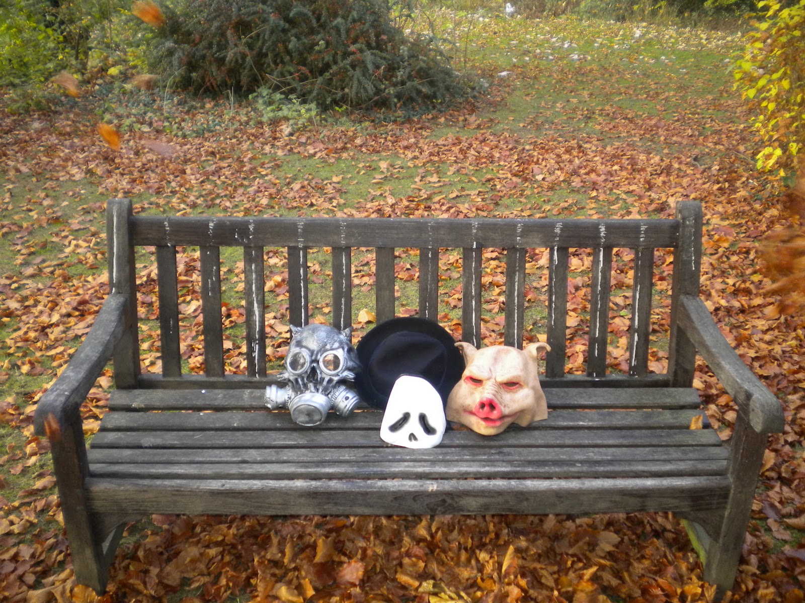
The theme will be the use of masks which is current in the music video and this will be the main image in the ancillary products. For the magazine ad, we will show the artist in full but multiplied, probably with the pig mask to show the weird side of the artist. The digipack will be a more striking image, probably of the masks on the floor to emphasise that the main theme is the masks.
Monday 14 November 2011
Thursday 3 November 2011
Music Video Analysis
http://www.youtube.com/watch?v=Wws7mnMewPw

We thought that Slipknots music video Psychosocial would be an interesting video to analysise as many of its goodwin points are similar to our video idea.
The lyrics match the visuals as they are trapped in a room and trying to get out which is matched by the lyric: "I did my time and I want out, so abusive."
The music matches the visuals as it is very jumpy and schreechy through a guitar while the visuals are edited in a fast pace and special effects are used to create a whirlwind effect.
There is a lot of intertextuality as the logo of the record label is shown by the band many times in the form of a burning sign, while there are references to a battle between Jesus and the devil which shows their satanic background.
The genre characteristcs are very representative as the many shots of the artist "rocking" and satanic symbols and burning are very typical of the genre.
Voyeurism is shown through the camera/audience being the victim of the bands games.
Wednesday 2 November 2011
Rough Cut Feedback
1. Goodwin
The visuals match the music because the music is creepy and surreal. The visuals feature halloween masks so its good.
2. Editing
Good use of editing of the lighting. Editing pace is also good and fits with the music. Good use of fades with the gas mask scene. On the end when the masks on the floor we think it should be shot with darker lighting.
3. Camera Work
Could use a range of shots. It was mostly close up/mid shots. P.OV. shots were really good. Very creepy. Some shaky shots.
4. Mise-en-scene
Masks add to the mystery of the song. Could vary the location to make it more interesting. Good use of the dark clothing which contrasts with the masks.
5. Creativity and Performance
Very unique and creative, use of masks and use of masks and use of reds on artists mask. Appeals to target audience as it's mysterious. Lip-synching very well done, believable performance. Could do with more narrative - a little confusing at times.
Subscribe to:
Posts (Atom)